Vision
ArtPrism.net (This domain no longer belongs to me), was a fun project I worked on in early 2018 in an attempt to try and build an art community from the ground up. My love for creating art in the form of graphics had faded over time, and a lot of my friends were in a similar position. Back when we were teenagers, it was common practice for us to create things, share them with each other and even compete with each other (Signatures usually) however the facilities to do this either were no longer present, possible or got kind of bland. I wanted to bring back that old energy and get people creating things again, but with unique ideas that would push peoples creativity.
As an example, I held a monthly contest called the Prism Challenge, and one of them was to create something relating to the word “Cover”. This could be in the form of a book cover, magazine cover, even a song cover if you were musically talented. It was a big success, and it started pulling in a lot of people outside my friend group which was amazing to see. Unfortunately, a sudden and unforeseen change in my personal circumstance meant that my time and motivation to continue ArtPrism had completely faded overnight. I promptly wrapped up the last contest and closed the website for good. I spent a lot of time and money on this, and it’s unfortunately one of my biggest failures, however I’m still very proud of what myself and the staff created, it was definitely unique which is saying a lot in 2018 when art communities have been done to death.
Development
Logo
The idea behind the logo was always going to be a prism. I went through a lot of designs, but finally settled on the below. I love the colours and have used them on a lot of different projects in my portfolio since (And previously). Finding the right font took a lot longer than I had anticipated, I think I spent a week testing hundreds of fonts and finally settled on Stereonic XS, which thankfully had a free version for personal use, and as the website was non profit, I knew I wanted to use this.

Alternative / Old Logos
Website Design
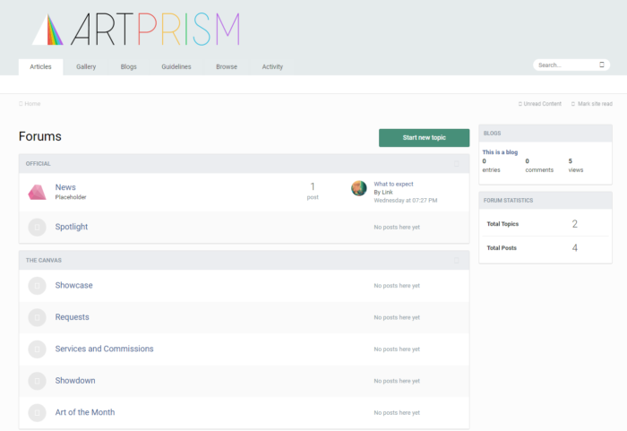
The website was built on Invision, I heavily modified the CSS (Although it may not look like it) to get it exactly the way I wanted with an almost Apple like grey feel to it (Unintentional, but looking back it definitely gives me these vibes). The screenshot below is from when I first created the website, so it’s lacking a lot of new details and all the activity it had.

Palette
Logo
Website
Fonts
- Stereonic XS – Logo


