Original Vision
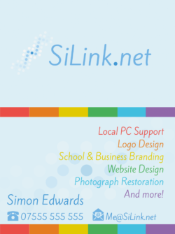
The original idea behind SiLink.net in 2014 was a place to advertise and list all of my services I offered. Back then I used this website as a business, which actually was semi successful especially in the web design aspect. At one point I got a ton of business cards printed for my local area, but I didn’t have the courage to post them through letterboxes.

Vision
It began dawning on me quite quickly that the stuff I make is 100x more fun if someone isn’t telling me what to do, so I knew the writing was on the wall: I was never going to make a living out of this. I felt like it was time for a change and so I converted SiLink.net into a personal website where I’d present the stuff I was most proud of.
Logos
V1
The very first logo was inspired by the structure of DNA. Did you know that humans share 99.9% identical DNA? All websites are mostly the same at a high level, much like all human beings, however that 0.1% is all it takes to make something unique and appealing, which is what I was trying to sell when showing off my services. I totally overthought this.
V2
As I transitioned from a business to a personal website, I began using my avatar at the time instead of a business logo. I wanted to use my favourite colours and make something completely random, abstract, cool and somewhat professional looking. I still really like this one, and it served its purpose for nearly 5 years.

V3
It became time to simplify my website a bit, and put a bit more effort into the presentation side of things. I actually used this logo in 2020 when creating A love letter to RuneScape Classic but its original intent was just a flashy intro card. Fast forward 5 years later, I replaced V2 with this, which I’m very happy with. It’s very minimalistic and simple, which summarises me perfectly 🤪
Websites
V1
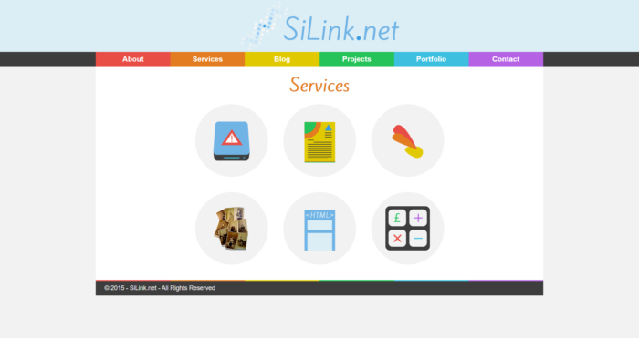
After I established what I wanted from the SiLink.net, I began coding mock up designs until I was satisfied. It had to be simple and easy to navigate around without confusing the user too much. As the design process went on, it quickly became apparent to me that mine did not look like a conventional website that offers the services that I do, which I saw as a good thing in order to stand out from the crowd. The navigation bar was originally going to be entirely black, but after playing with colours, I decided to try the colour spectrum, which fit into place really nicely alongside the sky blue header. I wanted to keep the area below the navigation greyscale so opted for grey sides, a completely white content area and a black footer.

I’m still a fan of this layout, but it really didn’t age gracefully.
You can view a backup of SiLink V1 here.
V2
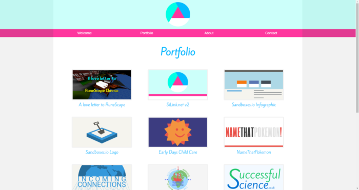
As time went on, I kept making slight adjustments to the website as a bit of a hobby. I wanted the website to stick out, be bold and in your face. I started using my favourite colours in their most boldest form. Overall, it’s not a whole lot different other than the colour, although behind the scenes almost all of the code was greatly improved. I introduced a dark theme as well, which was automatically used if the users operating system theme choice was also set to dark.

V3
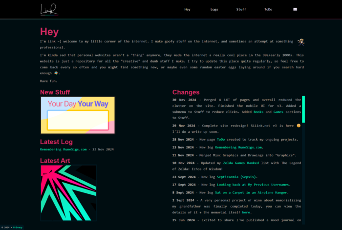
I am very proud of how this turned out, I feel like I finally stepped up my game after 10 years of operating SiLink.net. I liked the dark theme of V2 so much that I ended up just using that instead of having two themes. I went with very different colours this time around, and pushed for a more “neon” sort of theme. The navigation is less in your face and gives more visibility over the content.

Palettes
V1
V2
V3
Fonts
V1
V2
- Kite One – H1 Headings
- Ropa Sans – Subheadings, Navigation
- Caveat – Citations
- Open Sans – Paragraphs, Testimonials
V3
- Consolas – Pretty much everything
- sans-serif – Headings


